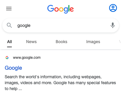
Every so often Google will put in place a string of tests focused on the design or functionality of prominent features. In this case, the search bar on mobile has been the focus over the past couple of months.
Almost a year ago, I wrote about how Google was testing similar on desktop. The main changes there related to placement of the magnifying glass and also a ‘clear’ icon, with a more simplified variation of this rolling out.
With the mobile search bar variations that are currently being tested on mobile, these are focused on either a sticky search bar feature (similar to desktop) and various treatments for the search bar itself.
The first test I stumbled across on July 23rd that made me pay more attention to this space was a sticky search bar treatment. The related queries and the switch between the Google logo and magnifying glass were a stand out.
This is pretty cool. A tidy looking sticky search bar test on mobile. Has related queries at the top & a switch from the magnifying glass to the G logo 👀 pic.twitter.com/z1ElgvGVzy
— Brodie Clark (@brodieseo) July 23, 2020
This was then shortly followed by a very similar test, but with a different related queries format. The related queries were similar to the dropdown that Google tested initially with COVID and with two fixed results at a time.
The treatment reminds me of the default search bar from when COVID started to become a lot more serious on March 17th. Crazy to think this test was almost 7 months ago now. Here’s what the other variation looks like:
Another sticky search bar test on mobile. Similar to the example I shared a couple of weeks back, but with a different related search format this time. And again with the magnifying glass/logo transition. pic.twitter.com/IbjpMYNGdy
— Brodie Clark (@brodieseo) August 7, 2020
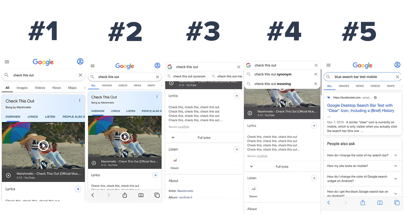
Those two are probably the most interesting out of the lot, with the sticky mobile search bar paired with the related search queries. The other three are focused on shadow variations and with a coloured outline.
Here’s what those three look like together:
Looking at the two variations at the top (with the shadows), both have slightly different treatments, but the text is smaller and the colour used for the tab selected is black rather than the standard blue. There’s a few different aspects that are different among the two.
The blue outline on the search bar is one that popped up for a short while but went away quickly. It does feel a bit bland and not in line with the others, which feel a bit fresher in comparison.
Something else worth noting that I’ve been tracking is the size of the text in the tabs. I’ve seen just about every size on my iPhone lately, from extremely large text to very small. Subtle, but changes nonetheless.
I don’t normally write about Google tests like this unless there’s been a noticeable and prolonged theme. The mobile search bar variations I’ve been seeing are certainly a project for Google which I’m sure we’ll see it result in a new variation seen by all users.
Keep an eye out for this string of tests and be sure to let me know if you stumble across any new variations and I’ll add to the collection.
Updates:
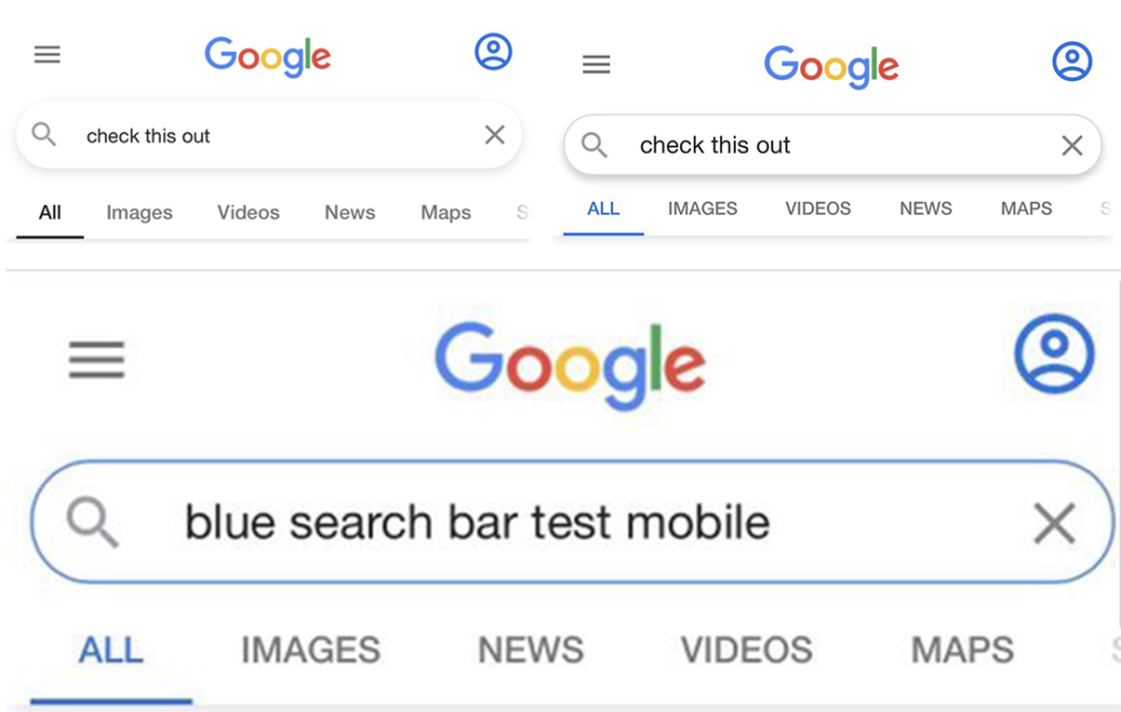
Another mobile search bar test. This one is a variation of #1 but with larger menu items that are more spread apart. Also spotted by Yvo Schaap through SEOBrowse.